트랜지션(transition)은 자바스크립트를 사용하지 않고 CSS만 이용하여 애니메이션을 구현하는 방법 중 하나로, 특정 CSS 속성 값을 일정 시간 동안 변경되도록 할 수 있는 속성이다.
transition: [transition-property] [transition-duration] [transition-timing-function] [transition-delay];
트랜지션은 transition-property, transition-duration, transition-timing-function, transition-delay 4개의 상세 속성으로 이루어진다.
각 속성은 생략이 가능하며, 순서는 자유롭게 바꿔도 되지만 transition-duration이 transition-delay 속성 앞에 위치해야 한다.
사용 예시는 다음과 같다.
/*
  transition-property: all
  transition-duration: 0.3s
  transition-timing-function: ease-in-out
  transition-delay: 0s
*/
.box {
  transition: all .3s ease-in-out;
}

/*
  transition-property: width
  transition-duration: 0.3s
  transition-timing-function: linear
  transition-delay: 0s
*/
.box {
  transition: .3s linear width;
}

/*
  transition-property: all
  transition-duration: 0.5s
  transition-timing-function: ease
  transition-delay: 0s
*/
.box {
  transition: 500ms;
}

/*
  transition-property: all
  transition-duration: 0.3s
  transition-timing-function: ease
  transition-delay: 0.1s
*/
.box {
  transition: .3s .1s;
}
이제 각각의 속성에 대해 알아보자.
transition-property
transition-property은 트랜지션 이벤트를 적용할 CSS 속성을 지정하기 위해 사용되는 속성이다.
기본값은 all으로, 모든 속성에 트랜지션 이벤트가 적용된다.
| 값 | 설명 |
| none | 아무 속성도 지정하지 않음 |
| all | 모든 속성에 지정 |
| css property명 (margin, width 등) |
|
| initial | 기본값 사용(all) |
| inherit | 부모 요소로부터 값 상속 |
주의해야 할 점은 display, content와 같이 트랜지션 적용이 불가능한 CSS 속성들도 존재한다.
트랜지션 적용이 가능한 CSS 속성은 다음과 같다. (자주 사용되는 속성은 굵은 글씨로 표시했다.)
| 분류 | 속성 |
| 배경 관련 속성 | backdrop-filter background background-color background-position background-size |
| border 관련 속성 | border border-block-end border-block-end-color border-block-end-width border-block-start border-block-start-color border-block-start-width border-bottom border-bottom-color border-bottom-left-radius border-bottom-right-radius border-bottom-width border-color border-end-end-radius border-end-start-radius border-image-outset border-image-slice border-image-width border-inline-end border-inline-end-color border-inline-end-width border-inline-start border-inline-start-color border-inline-start-width border-left border-left-color border-left-width border-radius border-right border-right-color border-right-width border-start-end-radius border-start-start-radius border-top border-top-color border-top-left-radius border-top-right-radius border-top-width border-width |
| flex 관련 속성 | flex flex-basis flex-grow flex-shrink |
| grid 관련 속성 | gap row-gap grid-column-gap grid-gap grid-row-gap grid-template-columns grid-template-rows column-count column-gap column-rule column-rule-color column-rule-width column-width columns order |
| margin & padding 관련 속성 | margin margin-block-end margin-block-start margin-bottom margin-inline-end margin-inline-start margin-left margin-right margin-top padding padding-block-end padding-block-start padding-bottom padding-inline-end padding-inline-start padding-left padding-right padding-top |
| outline 관련 속성 | outline outline-color outline-offset outline-width |
| 폰트 & 텍스트 관련 속성 | font font-size font-size-adjust font-stretch font-variation-settings font-weight text-decoration text-decoration-color text-decoration-thickness text-emphasis text-emphasis-color text-indent text-shadow text-underline-offset letter-spacing line-height word-spacing color |
| scroll 관련 속성 | scroll-margin scroll-margin-block scroll-margin-block-end scroll-margin-block-start scroll-margin-bottom scroll-margin-inline scroll-margin-inline-end scroll-margin-inline-start scroll-margin-left scroll-margin-right scroll-margin-top scroll-padding scroll-padding-block scroll-padding-block-end scroll-padding-block-start scroll-padding-bottom scroll-padding-inline scroll-padding-inline-end scroll-padding-inline-start scroll-padding-left scroll-padding-right scroll-padding-top scroll-snap-coordinate scroll-snap-destination scrollbar-color |
| 좌표 관련 속성 | top bottom left right |
| 박스 모델 관련 속성 | box-shadow width height max-width max-height min-width min-height |
| 이미지 관련 속성 | filter mask mask-border mask-position mask-size clip clip-path object-position |
| 공간(3D) & 회전 관련 속성 | rotate scale transform transform-origin perspective perspective-origin |
| 기타 속성 | opacity tab-size zoom visibility z-index vertical-align caret-color accent-color block-size inline-size |
transition-duration
transition-duration은 트랜지션 이벤트를 실행할 시간을 지정하기 위해 사용되는 속성이다.
기본값은 0초이고, s(초) 혹은 ms(밀리초) 단위의 값을 지정할 수 있다.
| 값 | 설명 |
| time (s 혹은 ms) |
|
| initial | 기본값 사용(0s) |
| inherit | 부모 요소로부터 값 상속 |
만약 transition-property에 여러 개의 CSS 속성을 적용한 경우에는 transition-duration도 동일한 개수 만큼 지정하면 된다.
transition-property의 속성보다 많은 수의 transition-duration을 지정한 경우, 초과된 값은 무시된다.
// 올바른 케이스
.box1 {
  transition-property: opacity, left, top, height;
  transition-duration: 3s, 5s, 1s, 2s;
}

.box2 {
  transition: opacity 3s, left 5s, top 1s, height 2s;
}

// 올바르지 않은 케이스: transition-property에 지정한 속성은 2개이므로 1s, 2s 값은 무시됨
.box {
  transition-property: opacity, left;
  transition-duration: 3s, 5s, 1s, 2s;
}
transition-timing-function
transition-timing-function은 트랜지션 이벤트의 진행 속도를 지정할 수 있는 속성으로, 기본값은 ease이다.
사용 가능한 함수의 종류와 설명은 다음과 같다.
| 값 | 그래프 | 설명 |
| linear | 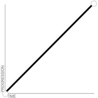 |
|
| ease | 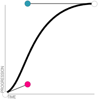 |
|
| ease-in |  |
|
| ease-out | 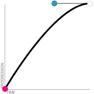 |
|
| ease-in-out | 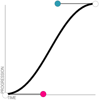 |
|
| steps(n, start | end) |
|
|
| step-start | steps(1, start)와 동일 | |
| step-end | steps(1, end)와 동일 | |
| cubic-bezier(x1, y1, x2, y2) | x1, y1, x2, y2에 해당하는 숫자를 넣어서 베지어 곡선을 그리고 해당 곡선을 따라 트랜지션 진행 | |
| initial | 기본값 사용(ease) | |
| inherit | 부모 요소로부터 값 상속 |
속도 비교를 위해 각 함수별로 3초간 트랜지션 이벤트가 동작하는 예제를 만들어 보았다.
See the Pen transition by MiJeong Kim (@sap03110) on CodePen.
transition-delay
transition-delay는 트랜지션 이벤트를 바로 실행시키지 않고 지연시키고자 하는 경우에 사용하는 속성이다.
기본값은 0초이며, transition-duration과 동일한 값을 사용할 수 있다.
| 값 | 설명 |
| time (s 혹은 ms) |
|
| initial | 기본값 사용(0s) |
| inherit | 부모 요소로부터 값 상속 |
transition-delay 값을 적절하게 지정하면 여러 개의 트랜지션을 순차적으로 하나씩 실행할 수도 있다.
다음은 opened 클래스가 추가되는 경우 background-color -> width 순서로 트랜지션이 실행되고, opened 클래스가 제거되는 경우 width -> background-color 순서로 트랜지션이 실행되는 CSS 코드이다.
.line {
  width: 80px;
  height: 8px;
  border-radius: 3px;
  transition: width 0.3s, background-color 0.3s 0.3s;
  background-color: #fff;
  margin: 0 auto;
}

&.opened .line {
  width: 0;
  transition: width 0.3s 0.3s, background-color 0.3s;
  background-color: #111;
}
실행 결과는 다음과 같다.
See the Pen hamburger toggle button by MiJeong Kim (@sap03110) on CodePen.
또한, 자바스크립트에서 transitionend 이벤트를 통해 트랜지션의 완료 여부를 감지할 수 있다.
다음과 같이 트랜지션 이벤트가 적용된 DOM 요소에 transitionend 이벤트를 부착하면 된다.
const element = document.querySelector('.box');
const handleTransitionEnd = () => {
  // 여기에 트랜지션 완료 후 실행할 코드 입력
  console.log('complete!');
};

element.addEventListener('transitionend', handleTransitionEnd);
참고 자료
CSS transition Property
W3Schools offers free online tutorials, references and exercises in all the major languages of the web. Covering popular subjects like HTML, CSS, JavaScript, Python, SQL, Java, and many, many more.
www.w3schools.com
CSS 트랜지션 사용하기 - CSS: Cascading Style Sheets | MDN
CSS 트랜지션은 CSS 속성을 변경할 때 애니메이션 속도를 조절하는 방법을 제공합니다. 속성 변경이 즉시 영향을 미치게 하는 대신, 그 속성의 변화가 일정 기간에 걸쳐 일어나도록 할 수 있습니
developer.mozilla.org
cubic-bezier.com
cubic-bezier.com
'Frontend > CSS' 카테고리의 다른 글
| CSS - 가이드 영역을 간단히 만들고 싶다면? mix-blend-mode 알아보기 (0) | 2024.11.22 |
|---|---|
| SASS/SCSS - sass에서 제공하는 디렉티브(mixin, include, ...) (2) | 2022.08.23 |
| CSS로 직접 그래프 만들기(bar, donut 그래프) + 애니메이션 효과 추가 (6) | 2021.08.20 |
| CSS - ellipsis(..., 말 줄임표) 처리 (0) | 2021.08.19 |
| CSS - HTML 태그 속성을 CSS에서 사용 / CSS 변수 선언 및 사용, 수정, 가져오기 (2) | 2021.07.15 |